What the Facebook Papers Taught Us About Affect and Design
Alexander Cho / University of California, Santa Barbara

One year ago this September, The Wall Street Journal began publishing a series of in-depth stories sourced from internal Facebook documents that detailed just how unwieldy Facebook and its subsidiaries had become, with deleterious effects ranging from exacerbating anxiety, depression, and body image issues for teen girls to fueling religious hatred and violence in India. Furthermore, these stories revealed that Facebook knew this and that company leadership was often indifferent toward implementing meaningful change in favor of, as whistleblower Frances Haugen testified, maximizing engagement and profit.
Finally, it seemed, the public, the media, and government decision-makers were beginning to think critically and in sync about the complex interrelationship between design features of platforms (“like” buttons, angry face emojis, endless scroll), algorithmic power (bias toward inflammatory content, the stunning potency of network effects), and the possible role of governance and regulation in all this. Then came one of the most effective corporate PR coups of this century: On October 28, 2021, the company announced a rebrand as Meta, with a focus on a generic virtual reality experience called the “Metaverse.” The massive critical discourse about its platforms all but vanished, replaced by think-pieces on our coming disembodied virtual future, the oldest sleight-of-hand trick in the digital book.
Part of the reason that this PR move was able to capture public discourse so quickly was that there was simply too much information contained in the leak, too many stories about too many things. It was hard to parse. With the exception of Instagram’s documented harm to teen girls, one year later very little seems to have stuck. What were the lessons learned from the Facebook Papers beyond “platforms can be bad”? Here, I want to offer two key takeaways that need to be talked about more, both in critical academic circles and in broader public discourse about social media: the dual importance of affect and design.

Affect Matters
As I and others have claimed, social media can and should be thought of as affect machines, generating, extracting, and capturing it.[1] Though definitions and usage vary widely, “affect” is generally understood in this genre of use as embodied sensation that has intensity and the capacity for transmission. It is often regarded as pre-cognate—the thing you feel before you realize you’re feeling it. In my use, I retain this element without disregarding the cognate, preferring instead not to think of affect in an exclusive binary or teleological progression, but rather as a recursive chain of pre- and post-cognate felt intensities—akin to Clare Hemming’s understanding of “maps of intensity.” [2] In fact, that could be a good way to describe social media platforms.
You have probably felt this, if you use them: the slight pang of panic and outrage when someone posts a negative comment on your post; the pop of validation when someone likes your cute selfie; the sympathetic vitriol when you come across a meme that brilliantly encapsulates your feelings on whichever hot topic is trending at that moment.
What the Facebook Papers revealed was just how effective an affect engine Facebook’s designers and engineers had built, to the point that it was running amok, and that they could barely—or did not want to—control it. We got a peek of this in 2014, when the infamous “Emotional Contagion” study was published. The Facebook Papers, sourced from the company’s own internal research, revealed much more about the interplay of affect, use, and design. On Instagram, 1 in 5 teens said that the platform made them “feel worse” about themselves; 32% of teen girls who already felt bad about their bodies felt worse about them because of Instagram. And in a rare example of non-cognate force made visible, researchers found that girls were aware of this happening to them but literally could not reduce their use, “unable to stop themselves,” in an “addictive,” negative affect loop.
There are many other examples of the role of affect, its extraction and capture. Researchers found that political parties in Spain gamed a Facebook algorithm change: “They have learnt that harsh attacks on their opponents net the highest engagement,” according to an internal researcher. Similar tactics were used in Taiwan and India.
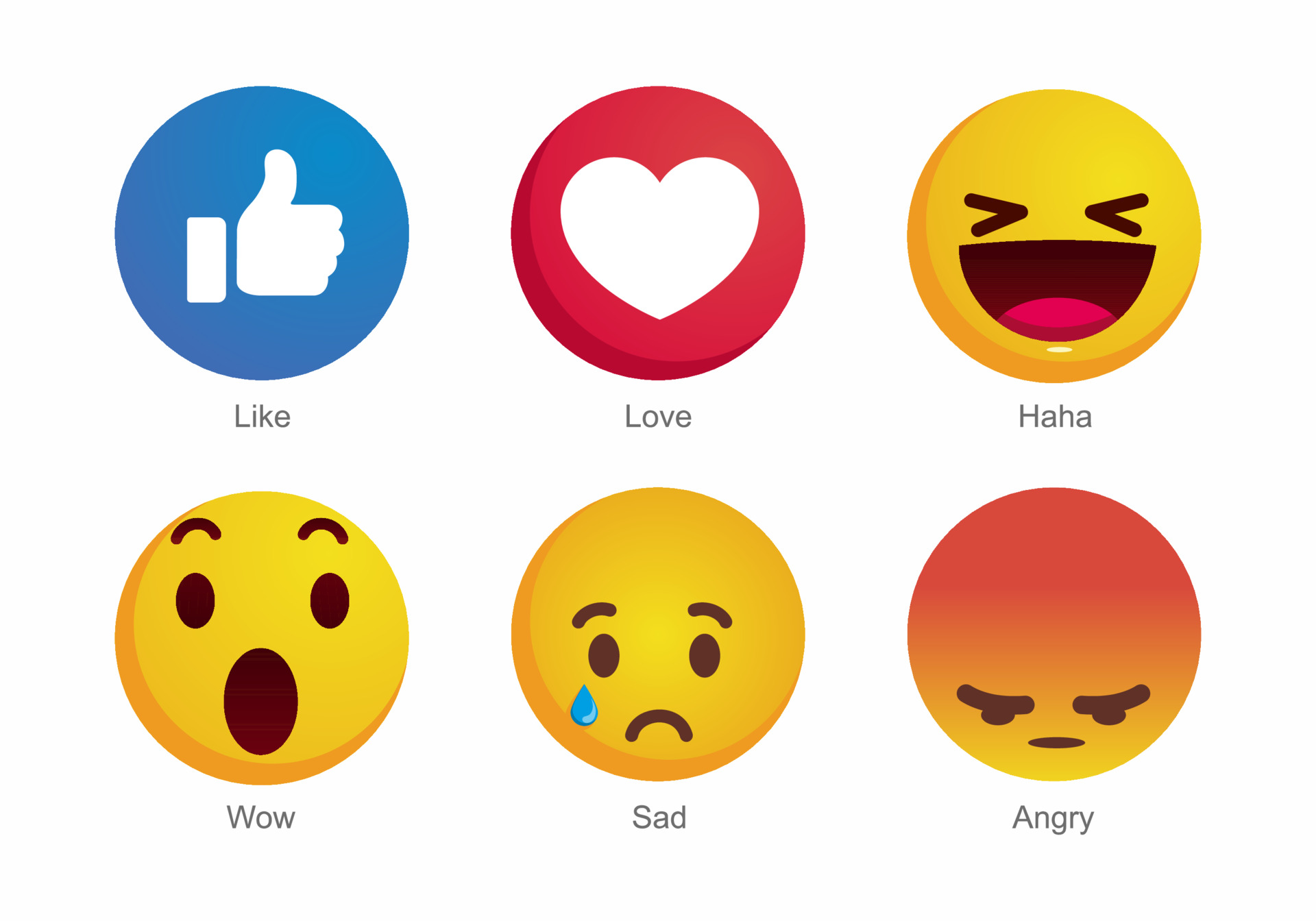
Reading the research around the “angry” emoji alone is a bizarre yet sobering experience, if we think of an emoji as a way to concretize and make visible an affective urge. When Facebook launched emoji reactions to posts globally in 2016—cartoon faces that indicate different emotional reactions such as “angry” or “wow”—they initially weighted them five times the weight of a simple “like” in their news feed algorithm. The emojis themselves became ciphers for type and even quality of content. Though “angry” was the least used of the emojis, it was “much more frequent” on posts that contained “civic low quality news, civic misinfo, civic toxicity, health misinfo, and health antivax content,” according to a Washington Post analysis of the Papers. “The ‘angry’ reaction, along with ‘wow,’ and ‘haha,’ occurred more frequently on ‘toxic’ content and misinformation.” While Facebook leadership was initially resistant to change any weighting, after several tweaks and multiple rounds of internal research, “angry” was finally weighted to zero, and users got less misinformation, less disturbing content and graphic violence. If nothing else, these examples should urge us to take affect seriously in the study of social media. Facebook certainly does.
Design for Intensity
Here, I am informed by what anthropologist Arturo Escobar calls a “cultural studies of design”: “the examination of the ways in which people’s everyday lives are articulated with culture within and through particular design practices” (51).[3] The Facebook Papers point to two interrelated interaction design issues in this way: the design of the news feed algorithm with regard to what inputs it weighs and how heavily, and the features designed into the platform such as commenting capability that feed users’ behavior into that algorithm.
Walking through the process Facebook used to create what it called “Meaningful Social Interactions”—and how this went awry—is a textbook case in why design matters in critical/cultural studies of social media. In 2018, in the face of a decline in user engagement, Facebook redesigned its news feed algorithm to promote “meaningful” interactions. It did so by weighing different sorts of interactions differently, framed through features built into its platform. According to the WSJ: “A “like” was worth one point; a reaction, reshare without text or reply to an invite was worth five points; and a significant comment, message, reshare or RSVP, 30 points. Additional multipliers were added depending on whether the interaction was between members of a group, friends or strangers.”
What emerged was perhaps predictable, yet apparently caught Facebook off guard: posts with more controversial content and heightened affective heft (measured in the form of emojis, “significant” comment chains, reshares, and more) were promoted by the algorithm. Specifically, an emphasis on reshares and commenting led to an emphasis on divisive content. Facebook’s internal researchers subsequently tried to crack down on “deep reshares” (when people unconnected to the original poster reshare the post) and “downstream MSI” (a calculation that the post would be reshared as it traversed the network).
In a separate internal study, Facebook’s researchers created dummy accounts to see what happened to them, such as “Carol Smith,” a “politically conservative mother from Wilmington, North Carolina,” who signaled an “interest in politics, parenting, and Christianity and followed a few of her favorite brands, including Fox News and then-president Donald Trump,” according to NBC News. Within two days, “Carol” was recommended QAnon groups she had never expressed interest in and faced “a barrage of extreme, conspiratorial, and graphic content” including groups that violated Facebook’s own internal rules. The same thing happened to a dummy Indian account “based” in Kerala. According to The New York Times, a Facebook researcher wrote, “Following this test user’s News Feed, I’ve seen more images of dead people in the past three weeks than I’ve seen in my entire life total.” Knowingly or unwittingly, Facebook had designed an experience that surgically arranged maximum intensity and vitriol.
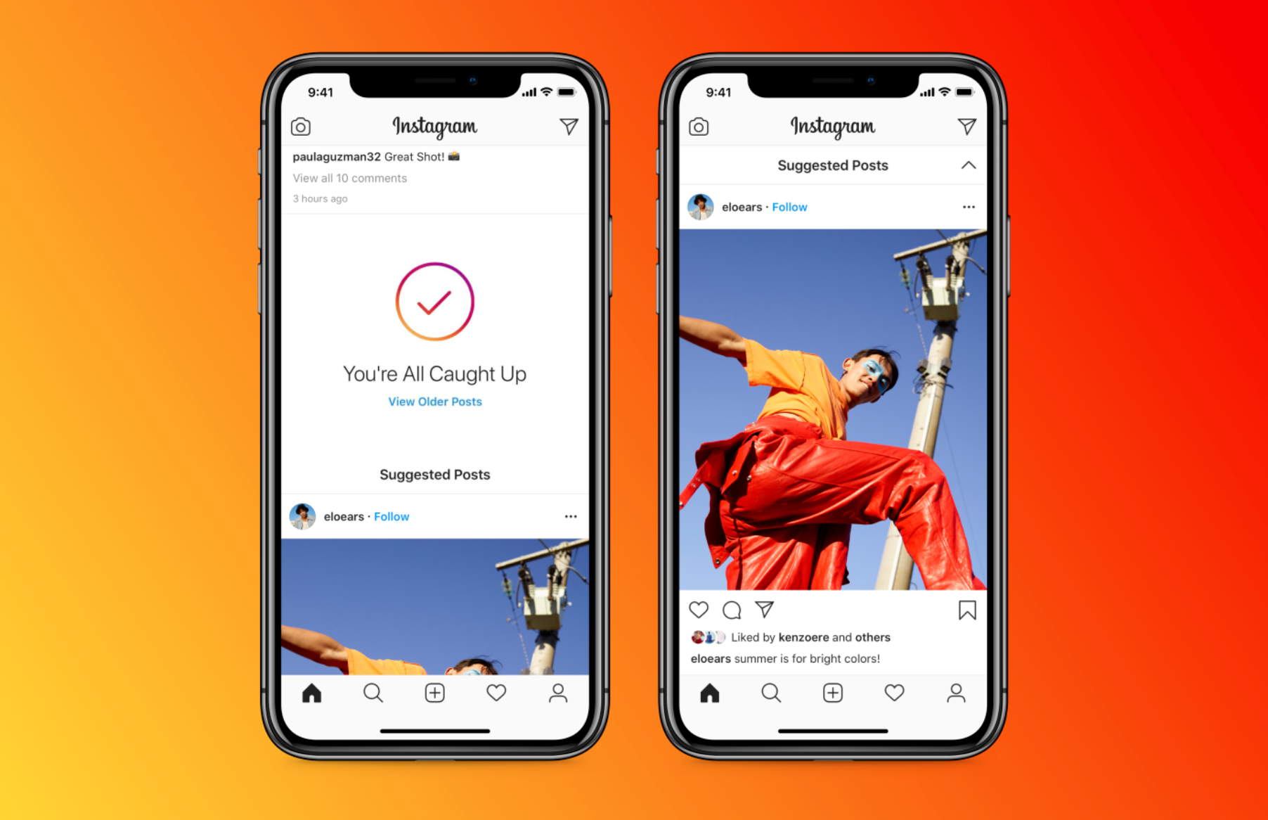
Whistleblower Haugen, in her testimony to the UK parliament, emphasized the role of design in regulating the intensity (and potential harm) of user experience on social media. For example, she suggested that platforms have myriad ways to create “friction” in the spread of content. She pointed to Twitter’s design decision to create a warning box before a user retweets a link to a story they have not themselves read and the possibility for Facebook to switch from an algorithmically-enhanced to a simple chronological news feed. Other extant examples of interaction design choices for “friction” might be Instagram’s addition of a note in your feed that you’ve reached the end of new content, or even the alerts on several platforms that “the story you are reading is 5 years old.” Of course, the problem with friction is that its purpose is to throttle engagement, which usually equals revenue.

What’s Next?
There are massive implications here: for policy and regulation, human communication, the economy, and our understanding of “the public.” But if nothing else, I offer this short piece to encourage digital communications and media studies researchers to think far more seriously about the role of affect and design in the structure and usage of social media. With a few notable exceptions, both of these areas have been strangely understudied within these fields. If we want to fully understand how social media affect our world (pun intended), it might be time for scholars in these fields to bridge the disciplinary gap and start reading, interrogating, and even building using the extensive literature on interaction design and user experience—which routinely addresses affect in the form of user motivation, urge, and satisfaction—while at the same time not giving up the inherent critical edge of media and cultural studies.
Image Credits:
- When Facebook first debuted emoji reactions they were weighted five times more than a “like.”
- On social media, engagement equals affective investment.
- Instagram’s “All Caught Up” note, an example of design for friction.
- See, to start: Papacharissi, Zizi. 2014. Affective Publics: Sentiment, Technology, and Politics. Oxford Studies in Digital Politics. Oxford, New York: Oxford University Press; Sampson, Tony, Stephen Maddison, and Darren Ellis, eds. 2018. Affect and Social Media. London ; New York: Rowman & Littlefield International; McGlotten, Shaka. 2014. Virtual Intimacies: Media, Affect, and Queer Sociality. Albany: State University of New York Press; Griffin, F. Hollis. 2017. Feeling Normal: Sexuality and Media Criticism in the Digital Age. Indiana University Press; Hillis, Ken, Susanna Paasonen, and Michael Petit, eds. 2015. Networked Affect. Cambridge, Massachusetts: The MIT Press; McStay, Andrew. 2018. Emotional AI: The Rise of Empathic Media. London: Sage Publications. [↩]
- Hemmings, Clare. 2005. “Invoking Affect.” Cultural Studies 19 (5): 548–67. https://doi.org/10.1080/09502380500365473. [↩]
- Escobar, Arturo. 2018. Designs for the Pluriverse: Radical Interdependence, Autonomy, and the Making of Worlds. Durham: Duke University Press Books. [↩]
It was an awesome post to be sure. I was completely delighted in understanding it in my noon. Will without a doubt come and visit this blog all the more frequently. A debt of gratitude is in order to share